React DND : Building a Simple Drag and Drop Component in React
In this tutorial, you’ll learn to develop an interactive component where we can drag elements from a source container and drop them into a target container. With easy-to-follow steps, you’ll master how to make components draggable, create drop zones, and handle data transfers. Immerse yourself in the process of building an engaging and enjoyable drag and drop component with React DND. Let’s get started!
Table of Content:
To follow this tutorial, you’ll need to have some knowledge of React and JavaScript. Make sure you have NodeJS and npm (Node Package Manager) installed on your machine to set up the development environment.
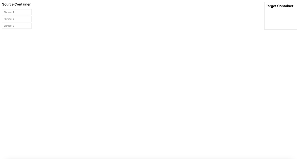
Below is a demo showcasing the appearance of our React DND component:
Setting Up the Project
Let’s begin by creating a new React project using Create React App:
npx create-react-app drag-and-drop-component
cd drag-and-drop-component
Next, we’ll install the necessary dependencies:
npm install react-dnd react-dnd-html5-backendreact-dnd is the core library for drag and drop functionality, and react-dnd-html5-backend is the HTML5 backend that will be used to handle the drag and drop operations.
About React DND Package
React DND (Drag and Drop) is a popular library that simplifies the implementation of drag-and-drop functionality in React applications. It provides a set of hooks and components to create interactive and seamless drag-and-drop interfaces.
Key Features of React DND
- Customizable Drag Sources: Easily make any component draggable with the
useDraghook, allowing users to initiate drag operations. - Drop Targets: Define drop zones using the
useDrophook, enabling components to accept dragged items. - Data Transfer: React DND facilitates the transfer of data between drag sources and drop targets, making it simple to handle data changes.
- Drag Previews: Render custom drag previews to provide visual feedback during drag operations.
- HTML5 Backend: Built-in support for the HTML5 backend, which handles drag events across different browsers.
- Multi-Type Drag and Drop: Supports multiple drag types, allowing different components to interact with each other.
- Custom Drag Layers: Implement custom drag layers to control what’s displayed during dragging.
- Native Drag Support: React DND works seamlessly with native HTML5 drag-and-drop events.
- High Performance: Optimized for smooth drag-and-drop experiences with minimal performance impact.
React DND is a versatile tool that empowers developers to build intuitive, user-friendly interfaces with drag-and-drop capabilities, making it an essential package for interactive web applications.
Building the Drag and Drop component using React DND
In our simple drag and drop component, we’ll have two containers: the “Source” container where draggable elements originate, and the “Target” container where these elements can be dropped. The goal is to drag elements from the source and drop them into the target container.
Building Draggable Elements
First, let’s create a component for the draggable element. In the src folder, create a new file called DraggableElement.js and add the following code:
import React from 'react';
import { useDrag } from 'react-dnd';

const DraggableElement = ({ name }) => {
  const [{ isDragging }, dragRef] = useDrag({
    type: 'element',
    item: { name },
    collect: monitor => ({
      isDragging: !!monitor.isDragging(),
    }),
  });

  const opacity = isDragging ? 0.4 : 1;

  return (
    <div
      ref={dragRef}
      style={{ opacity, cursor: 'move', border: '1px solid #ccc', padding: '10px', marginBottom: '5px' }}
    >
      {name}
    </div>
  );
};

export default DraggableElement;
In this component, we use the useDrag hook from react-dnd to make the element draggable. We specify the type as ‘element’ to differentiate it from other draggable components. The item property holds the data we want to transfer when the element is dragged. In this case, we pass the name prop as the item data.
Creating the Source Container: Constructing the Draggable Elements Origin
Next, let’s create the source container where our draggable elements will be placed. In the same src folder, create a new file called SourceContainer.js and add the following code:
import React from 'react';
import DraggableElement from './DraggableElement';

const SourceContainer = () => {
  const elements = ['Element 1', 'Element 2', 'Element 3'];

  return (
    <div style={{ width: '200px' }}>
      <h2>Source Container</h2>
      {elements.map((element, index) => (
        <DraggableElement key={index} name={element} />
      ))}
    </div>
  );
};

export default SourceContainer;
Here, we define the SourceContainer component that renders three DraggableElement components with different names.
Developing the Target Container: Defining the Drop Zone with React DND
Now, let’s create the target container where our draggable elements can be dropped. In the same src folder, create a new file called TargetContainer.js and add the following code:
import React from 'react';
import { useDrop } from 'react-dnd';

const TargetContainer = () => {
  const [{ isOver }, dropRef] = useDrop({
    accept: 'element',
    collect: monitor => ({
      isOver: !!monitor.isOver(),
    }),
  });

  const backgroundColor = isOver ? '#f0f0f0' : '#fff';

  return (
    <div
      ref={dropRef}
      style={{ width: '200px', border: '1px solid #ccc', padding: '10px', backgroundColor }}
    >
      <h2>Target Container</h2>
    </div>
  );
};

export default TargetContainer;
In this component, we use the useDrop hook from react-dnd to create a drop target. We specify the accept prop as ‘element’ to indicate that this container can accept elements of the specified type.
Handling Data Transfer: Enabling Dragged Element Interaction in React DND
In this section, we’ll enable data transfer between the drag sources and the drop targets.
Modify DraggableElement.js by adding a unique id prop to each DraggableElement to identify them uniquely when they are dragged.
// DraggableElement.js
import React from 'react';
import { useDrag } from 'react-dnd';

const DraggableElement = ({ id, name }) => {
  const [{ isDragging }, dragRef] = useDrag({
    type: 'element',
    item: { id, name }, // Include the 'id' prop in the item data
    collect: monitor => ({
      isDragging: !!monitor.isDragging(),
    }),
  });

  const opacity = isDragging ? 0.4 : 1;

  return (
    <div
      ref={dragRef}
      style={{ opacity, cursor: 'move', border: '1px solid #ccc', padding: '10px', marginBottom: '5px' }}
    >
      {name}
    </div>
  );
};

export default DraggableElement;
In the TargetContainer, we’ll handle the data transfer when an element is dropped. We’ll use the useDrop hook to define the drop behaviour.
// TargetContainer.js
import React, { useState } from 'react';
import { useDrop } from 'react-dnd';

const TargetContainer = () => {
  const [droppedElements, setDroppedElements] = useState([]);

  const [{ isOver }, dropRef] = useDrop({
    accept: 'element',
    drop: (item, monitor) => {
      // Get the dropped item's data
      const { id, name } = item;

      // Update the state with the dropped element
      setDroppedElements(prevDroppedElements => [
        ...prevDroppedElements,
        { id, name }
      ]);
    },
    collect: monitor => ({
      isOver: !!monitor.isOver(),
    }),
  });

  const backgroundColor = isOver ? '#f0f0f0' : '#fff';

  return (
    <div
      ref={dropRef}
      style={{ width: '200px', border: '1px solid #ccc', padding: '10px', backgroundColor }}
    >
      <h2>Target Container</h2>
      {droppedElements.map(element => (
        <div key={element.id} style={{ marginBottom: '5px', fontWeight: 'bold' }}>
          {element.name}
        </div>
      ))}
    </div>
  );
};

export default TargetContainer;
Integration: Composing React DND components
Now that we have created the draggable element, source container, and target container components, let’s combine them in the main App.js file:
import React from 'react';
import './App.css';
import SourceContainer from './SourceContainer';
import TargetContainer from './TargetContainer';

function App() {
  return (
    <div className="App">
      <SourceContainer />
      <TargetContainer />
    </div>
  );
}

export default App;
Styling the Components: Adding Visual Appeal to the Drag and Drop component
Finally, let’s add some basic styles to make our drag and drop component visually appealing. In the src folder, create a new file called App.css and add the following styles:
.App {
  display: flex;
  justify-content: space-between;
  padding: 20px;
}

h2 {
  margin-top: 0;
}

.SourceContainer, .TargetContainer {
  width: 200px;
  border: 1px solid #ccc;
  padding: 10px;
}

.DraggableElement {
  opacity: 1;
  cursor: move;
  border: 1px solid #ccc;
  padding: 10px;
  margin-bottom: 5px;
}

.TargetContainer {
  background-color: #fff;
}

.TargetContainer.isOver {
  background-color: #f0f0f0;
}
Testing the Application
We are now ready to test our simple drag and drop component. Start the development server using the following command:
npm startYour default browser should open automatically, and you will see the “Source Container” with three draggable elements on the left and the “Target Container” on the right. Try dragging any of the elements from the source to the target container.
Congratulations! You have successfully created a simple drag and drop component using React DND.
In this tutorial, we covered the basics of building a drag and drop component using React DND. We created draggable elements, a source container, and a target container, allowing users to drag elements from the source and drop them into the target container. React DND is a powerful library with many advanced features, and you can use it to create complex and interactive drag and drop interfaces for your React applications. Happy coding!
By Kurukshetran
Discover more react components like below


