Creating a React Component with Multiple Reactions – Building an Interactive Reaction Feature
React, being one of the most popular JavaScript libraries for building user interfaces, empowers developers to create interactive and engaging web applications. In this technical article, we will walk you through the process of building a React component that allows users to express their reactions using emojis, such as thumbs up, heart, laugh, and sad. We will utilize React’s useState hook and event handling techniques to achieve this functionality. Let’s dive in and create our interactive reaction feature!
Before proceeding, make sure you have a basic understanding of React and have set up a React application in your preferred development environment.
Complete source code for this react component is available in github repository.
Below is a demo showcasing the appearance of our reactions React component:
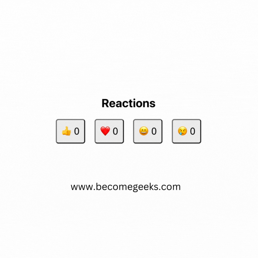
Table of Content:
Setting Up the Project
To begin, let’s create a new React project. Open your terminal and execute the following command:
npx create-react-app reactions-react-component
cd reactions-react-component
Building the Reactions Component
We will now create the Reactions component, which will handle and display the different reaction options.
import React, { useState } from 'react';

const Reactions = () => {
  const [reactions, setReactions] = useState({
    thumbsUp: 0,
    heart: 0,
    laugh: 0,
    sad: 0,
  });

  const handleReactionClick = (reactionType) => {
    setReactions((prevReactions) => ({
      ...prevReactions,
      [reactionType]: prevReactions[reactionType] + 1,
    }));
  };

  return (
    <div style={styles.container}>
      <h2>Reactions</h2>
      <div style={styles.reactionButtons}>
        <button onClick={() => handleReactionClick('thumbsUp')} style={styles.reactionButton}>
          👍 {reactions.thumbsUp}
        </button>
        <button onClick={() => handleReactionClick('heart')} style={styles.reactionButton}>
          ❤️ {reactions.heart}
        </button>
        <button onClick={() => handleReactionClick('laugh')} style={styles.reactionButton}>
          😄 {reactions.laugh}
        </button>
        <button onClick={() => handleReactionClick('sad')} style={styles.reactionButton}>
          😢 {reactions.sad}
        </button>
      </div>
    </div>
  );
};

const styles = {
  container: {
    display: 'flex',
    flexDirection: 'column',
    alignItems: 'center',
    margin: '20px',
  },
  reactionButtons: {
    display: 'flex',
    justifyContent: 'space-between',
    width: '300px',
  },
  reactionButton: {
    fontSize: '20px',
    padding: '10px',
    borderRadius: '5px',
    cursor: 'pointer',
  },
};

export default Reactions;
In this component, we use the useState hook to manage the state of the reactions. The reactions state object holds the counts of each reaction type (thumbsUp, heart, laugh, and sad). When a user clicks on a reaction button, the handleReactionClick function updates the state accordingly.
For styling, we use inline styles for simplicity. The styles object contains the CSS properties for the different elements of the Reactions component. We apply styles to the container, the reaction buttons container, and each individual reaction button.
The styles.container is used to center the component and add some margin around it. The styles.reactionButtons is used to arrange the reaction buttons in a row with equal spacing between them. Finally, the styles.reactionButton contains styles for each reaction button, such as font size, padding, and border radius.
Feel free to adjust the styles according to your preference and design requirements. You can also use external CSS files or CSS-in-JS libraries for more extensive and modular styling.
Integrating the Reactions Component
Now that we have built the Reactions component, let’s integrate it into our main application.
// src/App.js

import React from 'react';
import Reactions from './components/Reactions';

const App = () => {
  return (
    <div>
      <h1>React Interactive Reactions</h1>
      <Reactions />
    </div>
  );
};

export default App;
Congratulations! You’ve successfully created a React component with multiple reactions, allowing users to express their feelings using emojis. This interactive reaction feature can be integrated into various types of applications to engage users and gather valuable feedback.
In this article, we explored the use of React’s useState hook and event handling techniques to manage the state of reactions and update them based on user interactions. As you continue to enhance your React skills, you can further customize this component, add more reactions, or integrate it into different parts of your application.
Happy coding!
By Kurukshetran
Discover more react components like below