Creating a Stunning Animated Dots Loader React Component
In modern web development, loading animations play a crucial role in enhancing user experience. Creating an animated dots loader React component not only adds a touch of elegance to your application but also helps users understand that content is being loaded. In this article, we’ll walk you through the process of designing a stylish animated dots loader component using React, and we’ll explore various techniques to make it visually appealing.
Complete source code for this react component is available in github repository.
Below is a demo showcasing the appearance of our animated dots loader React component:
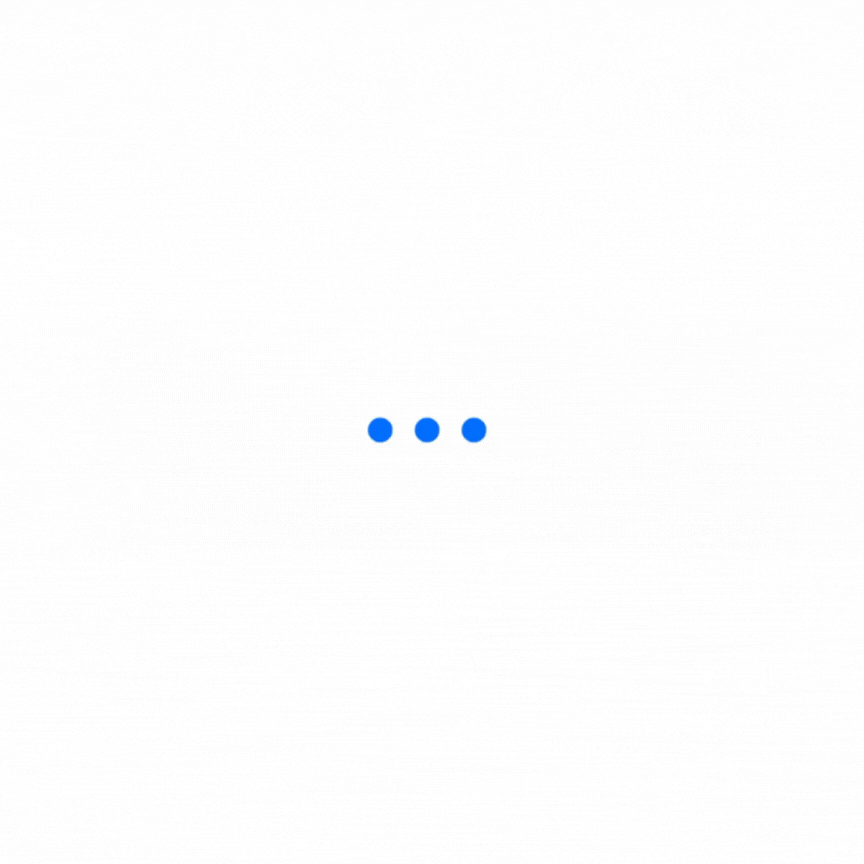
Table of Contents:
Setting up the Project
Begin by setting up your React project using either create-react-app or any other preferred method. This will provide you with a base structure to build the animated dots loader react component.
Creating the Loader Component
Create a new file, let’s call it DotsLoader.js, and define the functional component for the animated dots loader.
import React from 'react';
import './DotsLoader.css';

const DotsLoader = () => {
  return (
    <div className="dots-loader">
      <span className="dot"></span>
      <span className="dot"></span>
      <span className="dot"></span>
    </div>
  );
};

export default DotsLoader;- The first step is we import the
Reactlibrary. This is necessary because we are creating a React component. - Next, we defined the
DotsLoadercomponent as a functional component. Functional components are simpler and concise ways of creating React components, especially when the component doesn’t require state or lifecycle methods. - Inside the
DotsLoadercomponent, we define the JSX markup that represents the visual elements of our animated dots loader. In this case, we have three dots represented byspanelements. - We apply CSS classes to style the
dots-loadercontainer and individualdotelements. These classes will later be defined in a separate CSS file.
Styling the Loader
Now, let’s add some style to the component. Create a new file named DotsLoader.css and apply the following styles:
.dots-loader {
  display: flex;
  align-items: center;
}

.dot {
  width: 12px;
  height: 12px;
  border-radius: 50%;
  background-color: #007bff; /* You can use any color you prefer */
  margin: 0 6px;
  animation: pulse 1.5s infinite ease-in-out;
}

@keyframes pulse {
  0%, 100% {
    transform: scale(1);
  }
  50% {
    transform: scale(1.3);
  }
}- We start by defining the
.dots-loaderclass selector, which represents the container that holds the three dots. display: flex;is used to create a flex container, making the dots align in a row horizontally.align-items: center;centers the dots vertically within the container.- The
.dotclass selector represents each individual dot within the loader. width: 12px;andheight: 12px;set the dimensions of the dots to be 12 pixels, creating small circles.border-radius: 50%;gives the dots a circular shape by setting their border radius to 50%, making them perfectly round.background-color: #007bff;defines the color of the dots. You can customize this to any color of your choice using a valid color code.margin: 0 6px;adds a small 6-pixel margin to the left and right of each dot, providing some spacing between them.animation: pulse 1.5s infinite ease-in-out;applies the animation namedpulseto the dots. The animation will run infinitely with a duration of 1.5 seconds and an ease-in-out timing function.- We define the
pulseanimation using@keyframes. - The animation consists of two keyframes: 0% and 100%, and 50%.
- At 0% and 100%, the dots will have their default size (
scale(1)), creating a steady state. - At 50%, the dots will have a slightly larger size (
scale(1.3)), creating a momentary expansion effect. - The animation then loops smoothly between these keyframes, creating a pulsating effect for the dots.
Overall, the DotsLoader.css file brings life to our DotsLoader component by styling the container and dots using CSS. The combination of the dots-loader container styles and the pulse animation on the dot elements creates an elegant and visually pleasing animated dots loader effect in our React component.
Integrating the react component
To use the animated dots loader component, import it into your desired React component and render it where loading is required. Lets integrate our react component in App.js:
import React, { useState, useEffect } from 'react';
import DotsLoader from './DotsLoader';

const App = () => {
  const [loading, setLoading] = useState(true);

  useEffect(() => {
    // Simulate data loading delay for demonstration purposes
    const timer = setTimeout(() => {
      setLoading(false);
    }, 3000);

    return () => clearTimeout(timer);
  }, []);

  return (
    <div>
      {loading ? <DotsLoader /> : <div>Content Loaded!</div>}
    </div>
  );
};

export default App;
Congratulations! You have successfully created a stylish animated dots loader React component. By following the steps outlined in this article, you’ve not only improved the visual appeal of your application but also enhanced user experience during loading times. Feel free to customize the styles further and integrate the loader into your projects to create a seamless user interface.
Remember to keep the loader lightweight and optimize its performance to ensure a smooth user experience across various devices and network conditions. Happy coding!
By Kurukshetran
Discover more react components like below


