Creating an Elegant Toggle Button React Component: A Step-by-Step Tutorial
Toggle buttons are a common UI element used to switch between two states in a web application. Implementing an elegant and user-friendly toggle button in a React component can greatly enhance the overall user experience. In this article, we’ll walk through the process of creating a sleek and functional toggle button React component.
Complete code for this React component is available in github repository.
Table of Content:
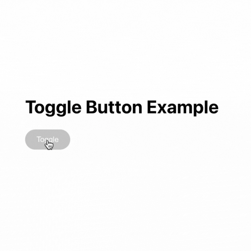
Our Toggle button react component will look like below:
Prerequisites
Before we begin, make sure you have a basic understanding of React and CSS. Familiarity with JSX syntax and component-based architecture will be helpful in following along.
- Nodejs
- ReactJs
Setting up the Project
Create a new React project by running the following command:
npx create-react-app toggle-button-react-component
cd toggle-button-react-component
Building the Toggle Button React Component
Let us create a toggle button react component by creating ToggleButton.js inside src folder.
Open ToggleButton.js and start by importing React and the useState hook, which will allow us to manage the state of the toggle button.
import React, { useState } from 'react';Next, define the ToggleButton functional component that takes two props – isActive and onClick.
const ToggleButton = ({ isActive, onClick }) => {
  // Component implementation will go here
};
Inside the ToggleButton component, use the useState hook to create a state variable called active, and set its initial value to the value of the isActive prop passed from the parent component.
const ToggleButton = ({ isActive, onClick }) => {
  const [active, setActive] = useState(isActive);
};
Next, add the handleToggle function to handle the button click event. This function will update the active state variable using the setActive function to toggle the state. Additionally, it will call the onClick prop function and pass the opposite value of active to notify the parent component about the toggle action.
const ToggleButton = ({ isActive, onClick }) => {
  const [active, setActive] = useState(isActive);

  const handleToggle = () => {
    setActive(!active);
    onClick(!active);
  };
};
Now, define the CSS class names and styling for the toggle button based on its active state. Also, render the button element using the calculated class name and attach the handleToggle function to the onClick event.
const ToggleButton = ({ isActive, onClick }) => {
  const [active, setActive] = useState(isActive);

  const handleToggle = () => {
    setActive(!active);
    onClick(!active);
  };

  const buttonClassName = active ? 'toggle-button active' : 'toggle-button';

  return (
    <button className={buttonClassName} onClick={handleToggle}>
      Toggle
    </button>
  );
};
Finally, export the ToggleButton component so it can be used in other parts of the application.
export default ToggleButton;Now, entire ToggleButton.js should look like below:
import React, { useState } from 'react';
import './ToggleButton.css';

const ToggleButton = ({ isActive, onClick }) => {
  // State to keep track of the button's active state
  const [active, setActive] = useState(isActive);

  // Function to handle the button click and toggle the state
  const handleToggle = () => {
    setActive(!active);
    onClick(!active); // Notify the parent component about the toggle action
  };

  // CSS class name to apply the appropriate style based on the active state
  const buttonClassName = active ? 'toggle-button active' : 'toggle-button';

  return (
    <button className={buttonClassName} onClick={handleToggle}>
      Toggle
    </button>
  );
};

export default ToggleButton;
Creating the CSS
In this section we will css for styling toggle button react component. Create a separate CSS file named ToggleButton.css and import it in ToggleButton.js. In the CSS file, define the styles for the .toggle-button and .toggle-button.active classes to control the appearance of the button in active and inactive states.
ToggleButton.css code:
/* Default style for the button */
.toggle-button {
    background-color: #ccc;
    border: none;
    color: #fff;
    padding: 10px 20px;
    border-radius: 20px;
    cursor: pointer;
    outline: none;
    transition: background-color 0.3s ease;
  }

  /* Style for the active state */
  .toggle-button.active {
    background-color: #007bff;
  }
Using the Toggle Button
Now, you can use the ToggleButton component in your main App.js like this:
import React from 'react';
import ToggleButton from './ToggleButton';

const App = () => {
  const handleToggle = (isActive) => {
    console.log('Toggle state:', isActive);
  };

  return (
    <div>
      <h1>Toggle Button Example</h1>
      <ToggleButton isActive={false} onClick={handleToggle} />
    </div>
  );
};

export default App;
In this example, the handleToggle function simply logs the current state of the toggle button when it’s clicked. You can customize the handleToggle function to perform any action based on the toggle state in your application.
Now you have successfully created the ToggleButton.js file, which contains the implementation of the Toggle Button React component! You can use this component in other parts of your React application to add elegant toggle buttons with ease.
By Kurukshetran
Discover more react components like below


1 Response